KT4
MOBILE APPLICATION UX PROJECT
PRODUCT
The existing mobile application for international transport drivers enabling contact with the forwarder, sending documents, receiving and executing orders, navigating, maintaining an electronic road card, sending statuses, and submitting acceptance protocols.
PROBLEM
The main problem was the drivers’ reluctance to use the current application due to its non-intuitive interface and complicated handling.
GOAL
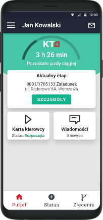
Redesign of the application, creating a friendly dashboard and easy access to the most important functions.
MY ROLE
UX designer. Tasks: information architecture, proposing changes, preparing wireframes, conducting usability tests and designing the interface.
PROCESS
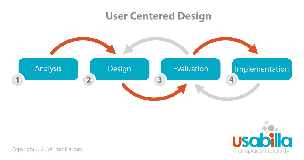
The project was created using the User Centered Design process, in which we went through the phases from analysis, sketching to evaluation and implementation.
ANALYSIS
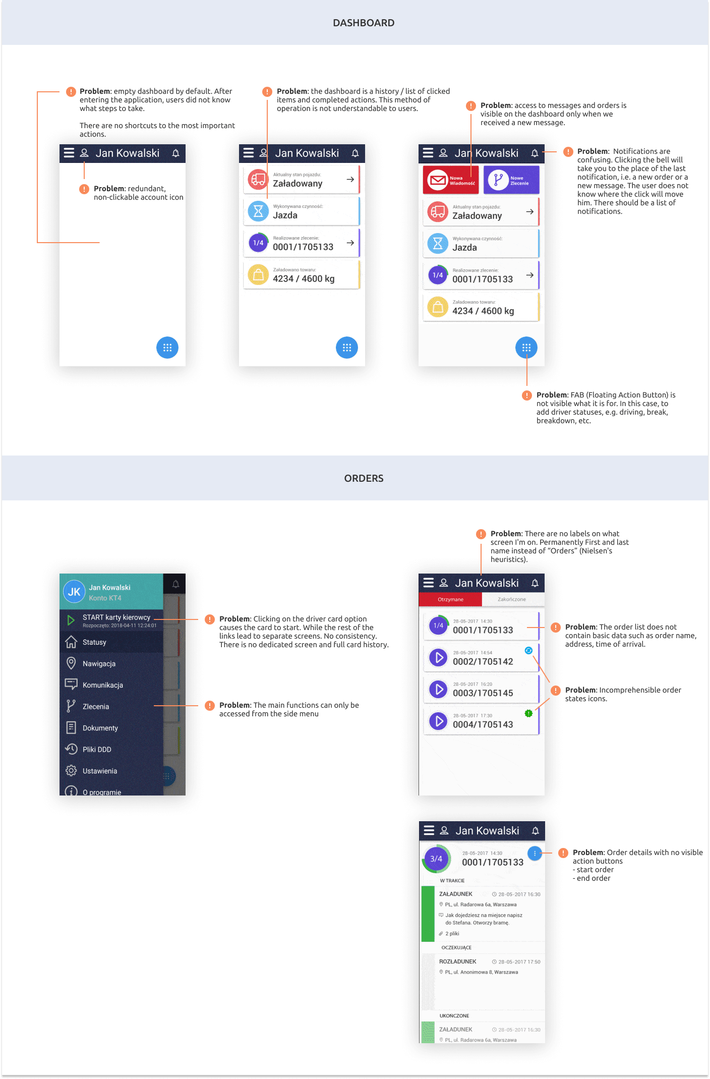
In the first step, I have analyzed the functionality of the current version of the application. Based on the problems reported by the drivers and my own conclusions, bearing in mind Jacob Nielsen’s heuristics, I have marked the points which cause problems in terms of the usefulness of the application.
SKETCHES AND DESIGNS
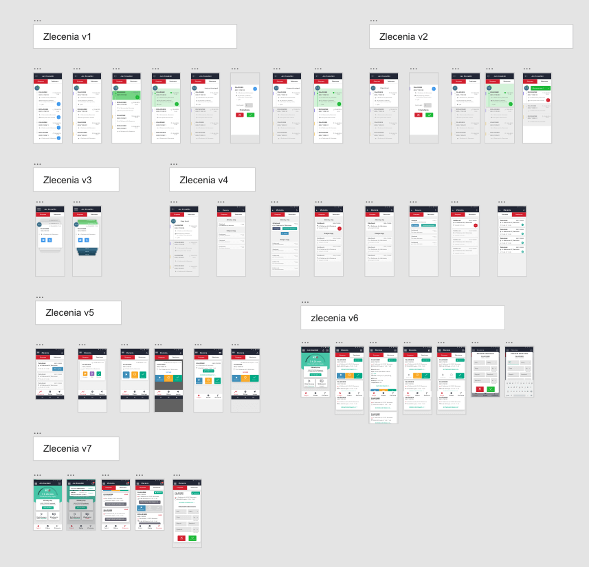
First of all, there were sketches on paper (unfortunately, no scans have survived). Then the solutions were transferred to simple prototypes for testing. Below you will find some draft versions of the orders.
USABILITY TESTS
The tests were carried out on a group of 18 drivers. Mixed group, without previous contact with the application.
The test included paths:
1. Activation of the drivers’ card
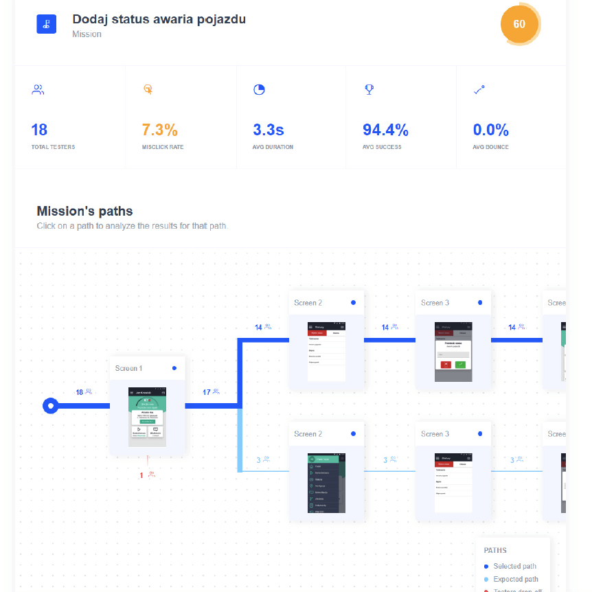
2. Addition of vehicle failure status
3. Termination of status
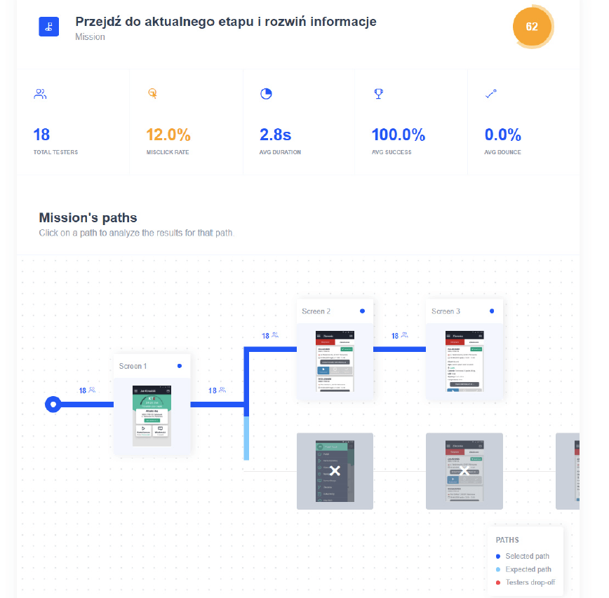
4. Moving to the current stage and opening additional information
5. Stage execution (start, wait, finish)
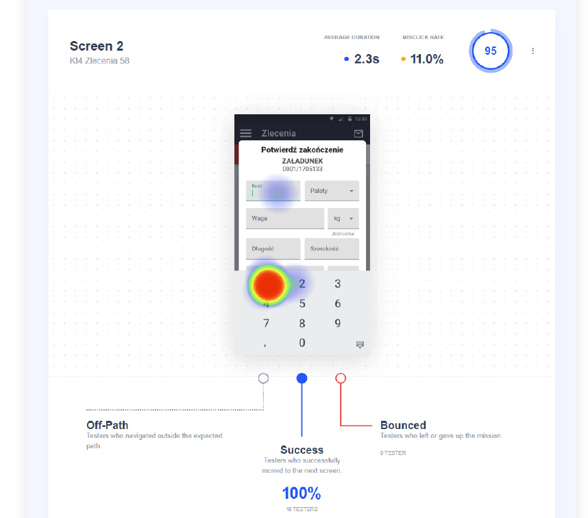
6. Entering data into the form and approving it
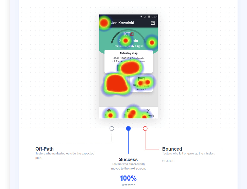
Access to a specific action such as the current stage was possible through 3 different paths. What shows us that 60% of users used a tile on a dashboard, 40% used a pictogram on the bottom bar (bottom menu). 0% used the hamburger (side menu) that in the previous version of kt4 enabled the transition to orders.
Conclusions
-
Drivers are more likely to use a dashboard to navigate the application than a side menu (77-100% of drivers chose this path) depending on the task.
-
Button labels should be clear, instead of e.g. “Details” it should be “Go to task”.
-
Key functions should have a history – statuses saved on the driver card, list of completed orders.
-
It is necessary to inform the driver about the effects of each action (confirmations and notifications), current window labels.
-
Consistency in the operation of elements within the application should be maintained. Menu tabs redirect to specific screens. One of the tabs cannot call up the action directly from the menu level (previously card start).
-
The envelope icon is a more appropriate link to the communicator than the bell icon. Especially as notifications about new orders, for example, also take place through the communication channel.
-
For this target group, it is easier and more natural to add driver status via the bottom menu instead of the floating FAB button.
AWARD
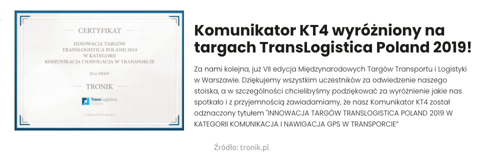
🏆 The new version of the application was awarded the title of innovation at the largest logistics fair in Central Europe.
